
Get inspired by some of the best Power BI dashboard examples and see how to turn complex data into meaningful, interactive reports and make profitable decisions.
What is the Need for a Business to Create Interactive Power BI Dashboards?
Every business is driven by data and numbers. However, all that data without clarity can lead to chaos as it can further result in misleading insights that lead businesses to make incorrect decisions. Hence, a tool like power BI dashboard templates can help enterprises to see and understand data.
What is Power BI? How Can Power BI Help In Understanding Business Data?
Power BI is an interactive data visualization tool developed by Microsoft. Its primary focus is on business intelligence. It helps combine data from different sources and display it as easy-to-read graphs and charts. It further gives a consolidated view of key performance indicators (KPIs).
Users can drill down into data, customize visualizations, and apply filters to uncover deeper insights. This can enhance data-driven decision-making, operational efficiency, and planning across multiple industries.
In this post, we will demonstrate some of the best real-world examples of Power BI dashboard templates to show how it can be useful across various industries. The intent of the post is also to demonstrate some of the best power BI reporting examples.
Best Practices for Designing a Power BI Dashboard
Well-designed Power BI dashboard templates enhances data clarity, decision-making, and user experience. This guide outlines best practices for creating effective dashboards, including simplifying layouts, ensuring data accuracy, using the right visuals, optimizing performance, and gathering feedback. Follow these principles to build interactive, insightful, and efficient Power BI dashboards for better business insights.
1. Consider Your Audience
One of the first things that you should consider when making a Power BI dashboard design is the audience you are making the dashboard for. Here are some points you should consider –
- Note down the key metrics that will help your audience make decisions.
- Where will your audience use the dashboard – on a desktop or a mobile/ tablet? You would have to accordingly tweak the content for better readability.
- Take note of any cultural or learned assumptions that you think may affect the design choices.
- Always try to include only the information which is the most relevant to your audience
2. Decluttered and Simple
The Power BI dashboard design should be such that a person can fetch important data at first glance. As such, it is important that the dashboard delivers the most useful information. When creating interactive Power BI dashboards, it is essential to remove any unnecessary clutter beforehand. This means only displaying essential metrics. Also, use a clean, structured, and consistent layout.
3. Ensure That The Data That You Are Using Is Accurate
When creating a dashboard in Power BI, you must validate your data sources and their relationships before forming the dashboard. Furthermore, you should avoid redundant tables and use proper data modeling. This practice ensures accuracy, optimizes performance, and prevents redundancy. Your business will eventually be able to make better decisions.
4. Make The Dashboard Visually Appealing
Visual appeal isn’t just confined to creating beautiful dashboards. Interactive Power BI dashboards should be clean, well-structured, and easy to understand. That can only be made possible if the right visuals are used. For instance, you can aim for line charts for the latest trends, charts for comparison, and KPIs for key metrics. Such visuals in power BI interactive dashboard improve user engagement, improve readability, and make well-informed decisions.
5. Optimize Performance
To enhance the Power BI dashboard’s user experience, it should be optimized well. To do that, you should use efficient DAX calculations and avoid complex measures. Another practice to speed up data processing while ensuring accuracy is to use aggregations instead of using raw data. Apart from that you should use only relevant visuals to improve responsiveness and prevent any lags.
6. Test & Gather Feedback
It takes a considerable amount of time and effort to prepare power BI design templates. You wouldn’t want to land in a situation where your dashboard isn’t able to fetch the intended data. So, when creating Power dashboards, regularly share them with users and ask for feedback. This way, you will be able to spot issues and rectify them timely.
Types of Power BI Dashboards
There are multiple kinds of power BI dashboard ideas. Before we delve deeper into some real-world Power BI examples, let’s first have a look at some popular types. These types will give you an idea of what elements are included in various types of dashboards –
1. Marketing Dashboard
This type of Power BI template analyzes website traffic, campaign performance, conversion rate, and customer engagement.
2. Sales Dashboard
With a sales Power BI dashboard, you can track revenue, sales performance, customer trends, product performance, etc.
3. HR Dashboard
With this dashboard, users can track hiring trends monitor employee performance, workforce diversity, and turnover rates.
4. Customer Service/ Support Dashboard
A customer service Power BI dashboard tracks metrics like ticket resolution, customer interactions, service quality, satisfaction scores, and others.
5. Power BI Marketing Dashboard
A marketing Power BI dashboard displays data from various marketing campaigns. You can visualize campaign performance, website traffic, conversion rates, and other such metrics.
6. Finance Power BI Dashboard
Power BI finance dashboard is a visual representation of financial performance indicators such as expenses, revenue, profit margins, cash flow, etc. All such metrics are viewed through interactive charts and graphs.
24 Best Power BI Dashboard Examples
Now that we have a broad idea of Power BI dashboard types let’s look at some power BI dashboard design ideas.
1. Customer Satisfaction Dashboard
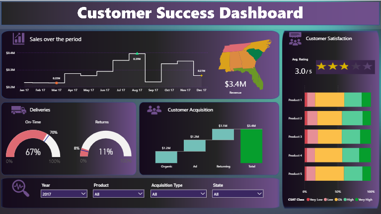
As can be seen from the screenshot, this Power BI dashboard, which demonstrates customer satisfaction, displays information about customer acquisition, revenue, sales over the period, and ratings. These metrics are illustrated using elements such as waterfall charts, column charts, 100% stacked bar charts, gauge charts, and map visualizations.
The interactive Power BI dashboard utilizes multiple filters, enabling more in-depth analysis of the data. The stunning power BI dashboard designs can be used to measure customer satisfaction ratings, identify trends, and make decisions based on data to improve customer experience.
2. HR Analytics Dashboard
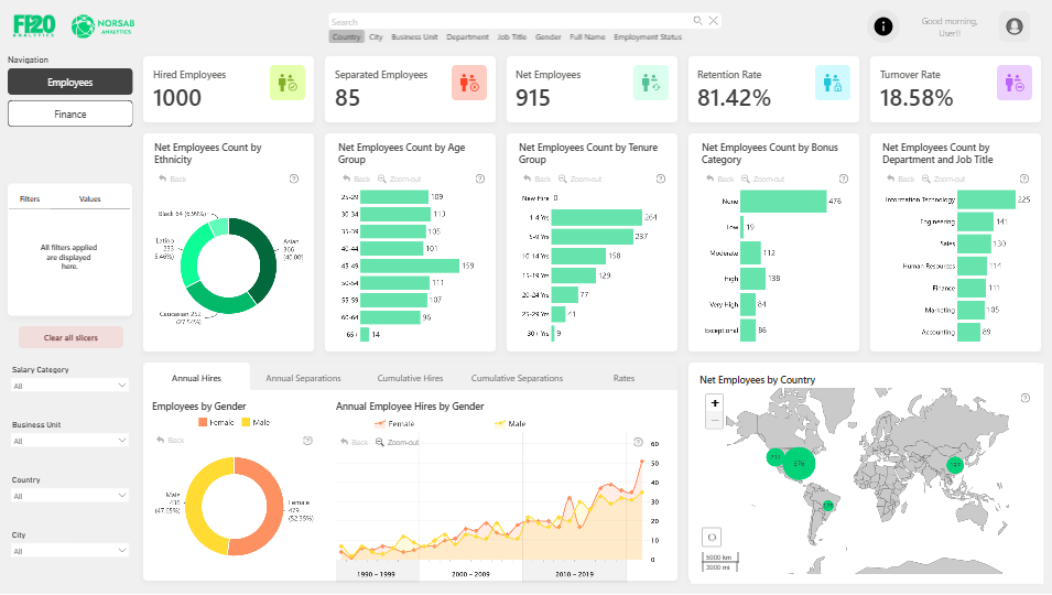
The above HR analytics Power BI dashboard acts as a powerful tool with which HR professionals can gain actionable insights into metrics like employee demographics, salary distributions, workforce trends, and retention metrics. The dashboard helps users delve into hiring, salary disparities, and separation trends.
By analyzing all the above-mentioned HR-related metrics comprehensively in one central place, HR professionals can make data-driven decisions. You can find various Power BI HR dashboard templates free download online.
3. Time Tracking Dashboard for Harvest
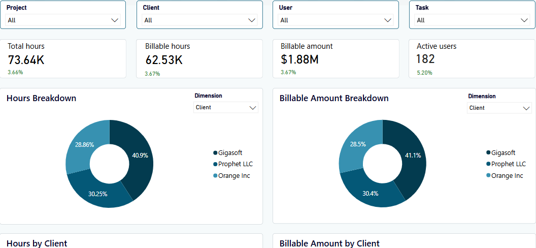
The time-tracking Power BI dashboard broadly shows metrics demonstrating the time usage of a team delivering paid services. The dashboard comprehensively shows how time spent converts to profits. You can even monitor profit margins client-wise.
Additionally, the dashboard also offers various filters to fetch particular results based on your needs. For example, you can select a particular client and individually look at the billable hours, billable amount, active users, and other aspects of a particular project.
4. Movie Industry Insights Power BI Report
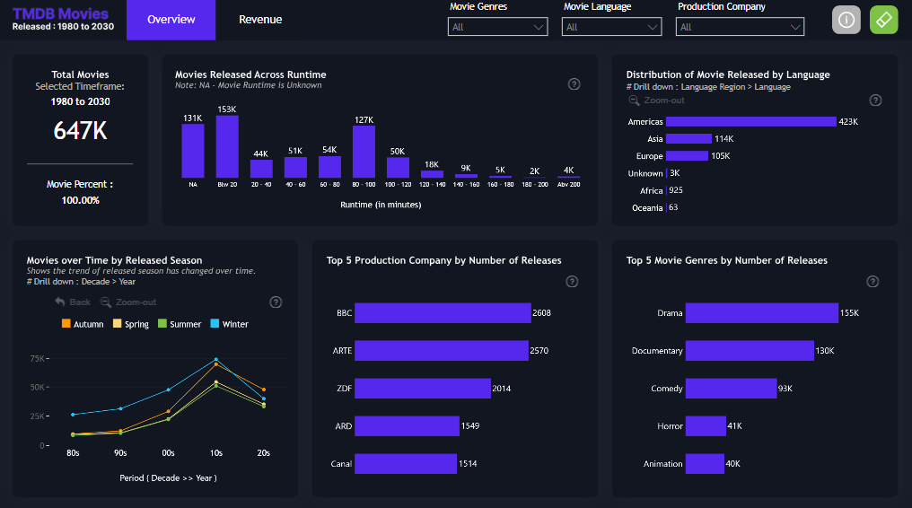
The above-demonstrated dashboard made in Power BI aims to explore trends in the movie industry. For various movie genres, you can see graphical representations of runtime, distribution across regions, the top production companies in that particular genre, the top movies, and the number of movies released in that genre.
There is also a second page that demonstrates the relation between these factors. The actionable Power BI dashboard implements cross-filtering and drill-down for an intuitive user experience.
5. Financial Analytics Dashboard
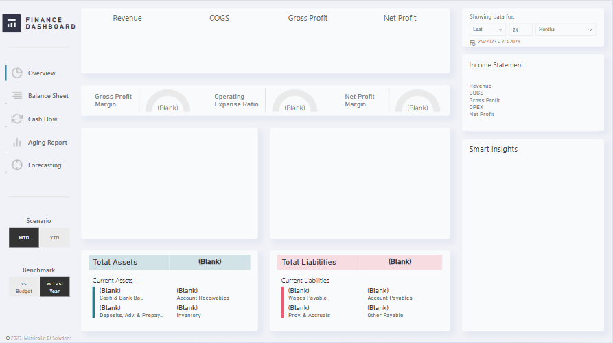
The above Power BI financial dashboard exhibits the financial KPIs of a company. The actionable power BI finance dashboard provides real-time insights into metrics like cost of goods sold, total revenue, net profit, and gross profit. You can access financial statements such as balance sheets, cash flows , etc ,and conduct a year-on-year comparison. The dashboard even shows you a clear picture of your assets and liabilities in real-time.
To visualize data, various filters and pictorial elements are used in this Power BI financial dashboard example. The elements used include funnel charts, column charts, gauge charts, combined lines, etc.
6. Christmas Gift Trends Power BI Sales Dashboard
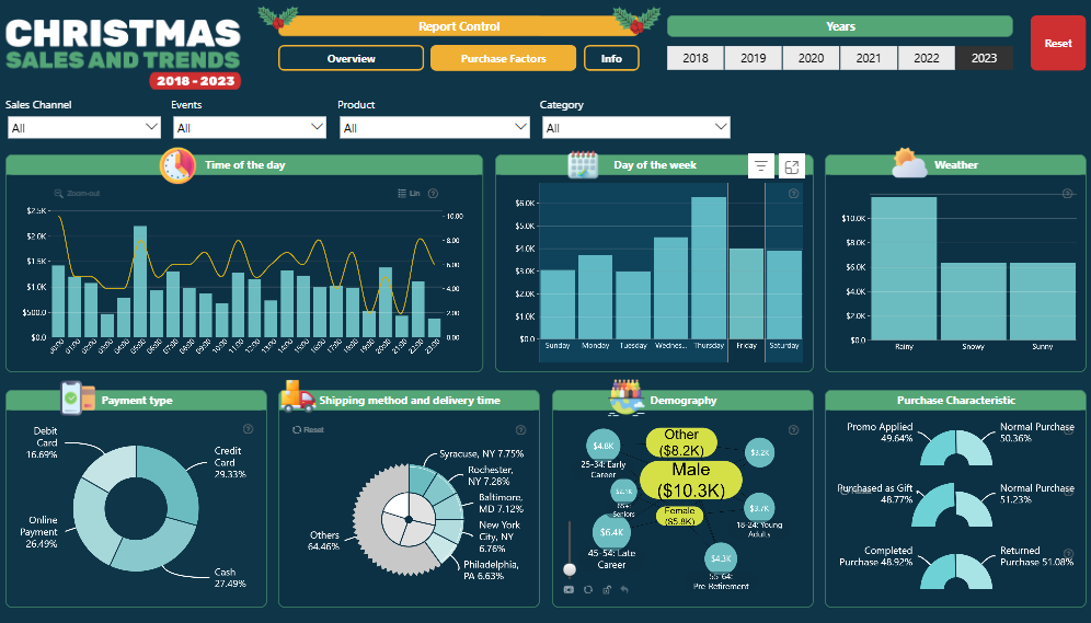
The Power BI dashboard example shows Christmas sales and trends. The report allows users to analyze the same data across various dimensions. You can analyze sales by city, buyer demographic, time of purchase, and others. There is also a second page that gives you even more detailed insights like shipping method, sales per permanent type, and weather conditions.
These beautiful power BI dashboards contain multiple kinds of visual elements are used to depict the sales data. There are bar charts, doughnut charts, line charts, and other elements.
7. Logistics
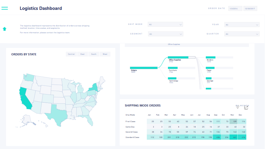
This dashboard in Power BI helps understand the distribution of orders across locations, shipping methods, segments, and time scales. It is created to help understand the product flow. The report also provides a view of delivery methods, locations, and products. The sample power BI report can be used to allocate resources so that delivery standards can be met.
The dashboard metrics that can be accessed include orders by state, month, shipping mode, and number of orders and customers.
8. Google Analytics 4 Power BI Dashboard
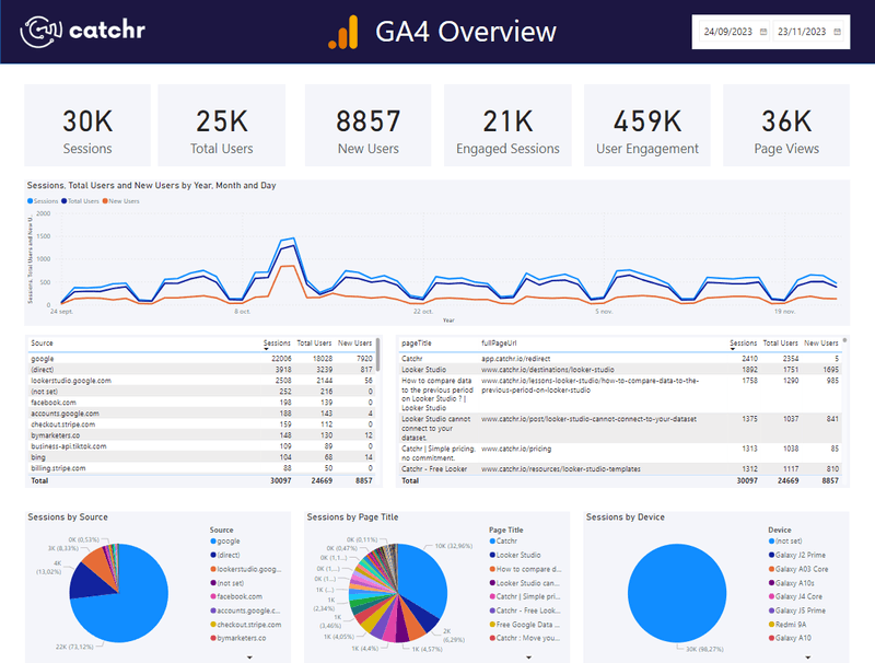
If you use Google Analytics 4 to analyze and improve website and app traffic, this is a Power BI dashboard you can use. It gives you a quick overview of your traffic and visits. The power BI interactive dashboard shows you various metrics and dimensions such as session source, page title, full page URL, total users, new users, user engagement, view, and many other metrics.
Various visualization types are employed in this Power BI dashboard, such as line charts, pie charts, details, and others.
9. Competitive Marketing Analysis Sample for Power BI
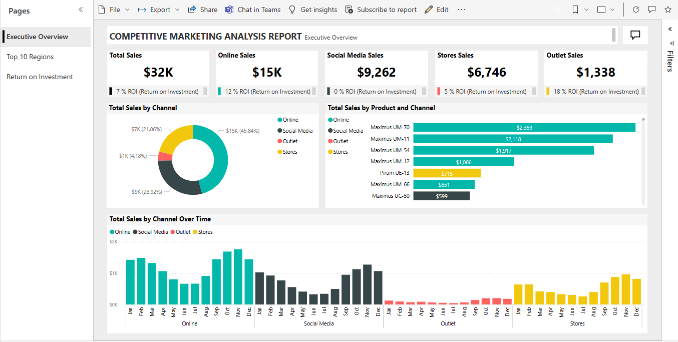
This Power BI marketing dashboard example helps track product volume, market share, sales, and sentiment. Via donut charts, numbers, bar graphs, and other visual elements you can see total sales figures, especially why the company’s market share has started to dip significantly in June.
Since the report experience is similar, both in Power BI Desktop, and service, you can follow along using the downloadable .pbix file.
10. Healthcare
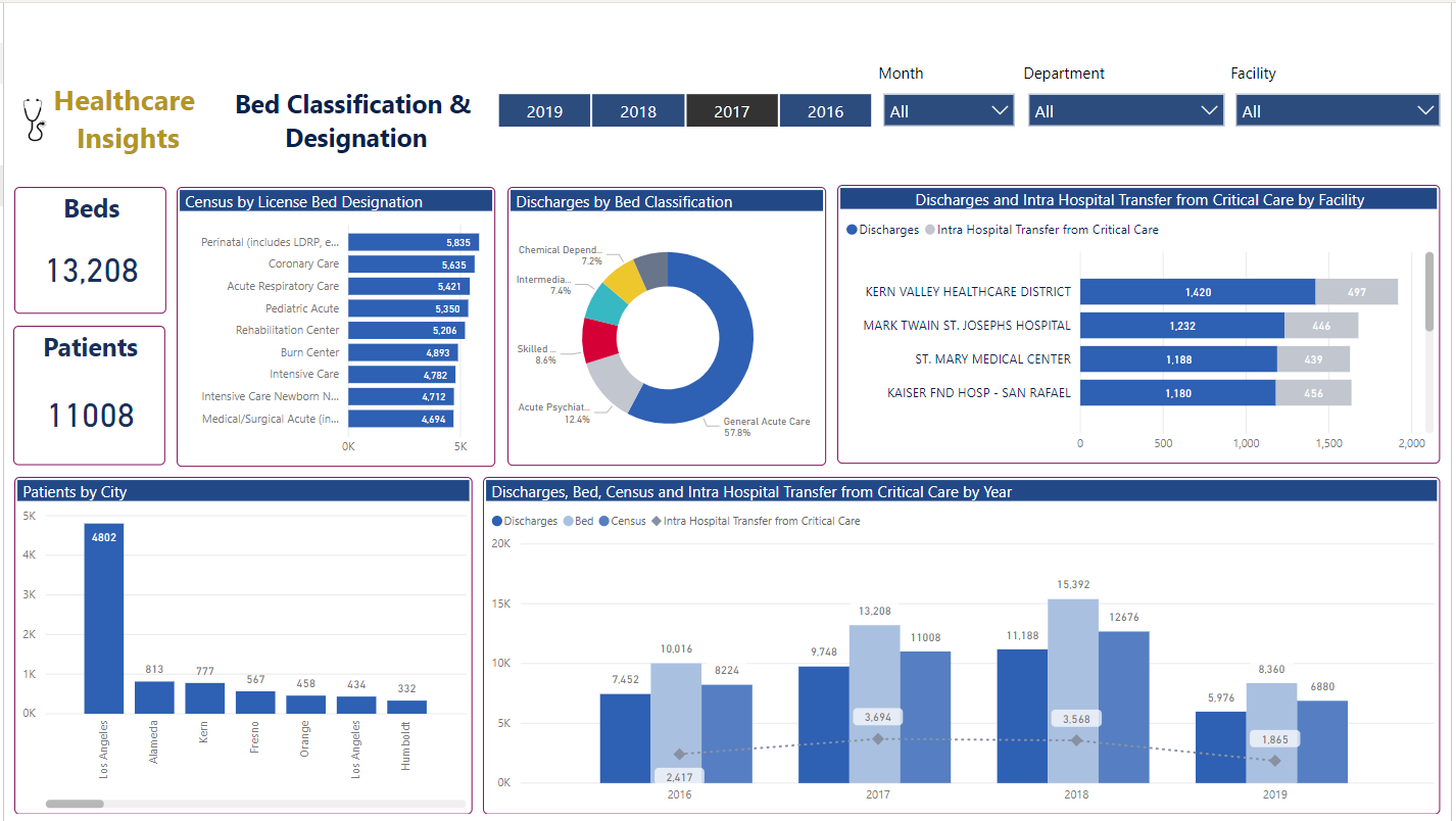
The demonstrated healthcare dashboard helps healthcare organizations, regardless of size, to fetch insights into single or multiple patients, facilities, clinical records, departments, revenue, and other metrics. This way, the organization can provide good patient support and grow simultaneously.
The metrics demonstrated in the above power BI sample reports include patient visit summary, key hospital statistics, department-wise information, revenue summary, bed clarification and designation, and other aspects.
11. Power BI Dashboard Example For Web analytics

Power BI dashboards for web analytics help in gaining profound information about the user journey on the website. First of all, it offers insights into total unique pageviews, which helps estimate the traffic coming to different pages included in the website. Data about page exits and bounce rates helps to identify the areas for improvement and thus make the necessary changes.
Dashboard in Power BI also helps to identify the devices being used by the target audience to open the websites. Thus, all the elements and components of the websites can be adjusted accordingly.
12. Power BI Dashboard Example For All-in-one Marketing

The above image is one of the power BI reporting examples that offers clear insights into the amount spent on the marketing campaign within the last 2 years. At the same time, it also offers accurate information about purchases that were made by people in different age groups, as well as their income level.
This is one of the interactive Power BI dashboards that talks about multiple marketing campaigns within a single view. The bottom right corner of the dashboard talks about the success rates of different marketing campaigns conducted at different times.
13. Power BI Dashboard Example for All-in-one Social Media Analytics

Best Power BI dashboard examples also consist of social media dashboards that help to understand the performance of the company on various social media platforms. Taking the above image as a reference, the power BI sample reports talk about the overall score of the post and target, along with the number of shares, shares/post, unique comments from the users, and the entire timeline of the report.
Moreover, the report also shows the number of shares and posts every year, along with defining the best posts, the maximum number of shares, and much more.
14. Power BI Dashboard Example For SEO

SEO is a complicated profession that requires keeping track of various numbers and trends to get a good ROI. Dashboards in Power BI have made it easier for SEO professionals to get all the relevant insights in a single place for easier and better understanding. For instance, the above SEO-dedicated Power BI dashboards talk all about Google ranking of the website, along with the backlinks performance, impressions, citation flow, new and lost links, etc.
Moreover, the power BI designs is smart enough to offer a reliable score to the website in terms of its performance, SEO-friendliness, best practices, and accessibility.
15. Power BI Dashboard Example For Brand Awareness

Brand awareness is indirectly associated with the ad performance on the various platforms and the clicks that have been received through the ad campaigns. Ads are run by the companies to increase their brand awareness, and thus, a good ROI of an ad campaign is considered a good sign of increasing brand awareness.
The above power BI examples dashboard well indicate the overall ad impressions run by a company using Facebook, Google, and Microsoft. At the same time, information like ad clicks, ad spent, branded impressions, and branded clicks is also provided on the same screen.
16. Power BI Dashboard Example For PPC

PPC is a part of a paid ad campaign where businesses are charged for every click they get through their ads. Power BI PPC dashboards are highly helpful to keep track of expenses as well as the results driven from the PPC ad campaigns. For example, the above dashboards offer good information about the budget of the PPC campaign, impressions received, clicks generated, CTR (click-through rate), performance of the ad over various months, CTR dynamics, and comparison of CTR with impressions.
17. Power BI Dashboard Example For Sales

Power BI dashboards best practices help the sales professionals to get a unified view of their clients, expenses incurred to attract the clients, and different channels that customers are using to reach the business. The above example of Power BI sales dashboards talks about the overall sales, along with distributing the amount in terms of online sales, store sales, social media sales, and outlet sales. A graphical representation of the same information is also provided for better and easier understanding.
The right side of the sample power BI reports talks about the total sales of a particular product from a specific channel, whereas the bottom of the dashboard sheds full light on total sales generated via various channels in a particular timeline.
18. Power BI Dashboard Example For CRM

CRM refers to the customer relationship management that helps a brand to know about its customers, provide the best services, and increase brand loyalty. Power BI dashboards also consist of the CRM screens that allow the business owners to choose a timeframe and extract the information from that session only. The above Power BI CRM dashboard is designed to have insights into overall sales along with win rate, close rate, pipeline value, open deals, and much more.
The bottom part of the dashboards showcases the accurate forecast of deals projects in the future 12 months on the basis of historic data and market trends.
19. Power BI Dashboard Example For E-Commerce

eCommerce business owners need to know the inside-out of their business in order to sustain in the competitive market. Power BI dashboards are of significant help in this type of situation, where they can offer highly actionable insights in one place. Whether it is total sales, inventory quantity, or the sum of profit over time, everything can be calculated on a single dashboard.
The above Power BI eCommerce dashboard talks about sales from different states, the amount received from various payments received from various mediums, and the profit generated from the different types of products. There are free dashboard template that can be found online.
20. Power BI executive dashboards

Power BI executive dashboards are the visual presentation of data that is designed for the business decision makers to have all the insights at one glance and take data-driven decisions. For instance, the above Power BI executive dashboard is offering complete insights into the net sales, COGS (cost of goods sold), and the gross margin gathered by the brand during the whole process.
At the same time, it also tells whether the sales, COGS, and gross margins have increased or decreased as compared to the previous timeline or year.
21. Power BI Dashboard Example For Project Management

Project management Power BI dashboards allow the entire team to work collaboratively on a project while marking the key milestones, challenges, and resolution times with the highest accuracy. The above Power BI project management dashboard provides information about four teams managing their project. The top part of the dashboard gives a summary of the first 4 weeks during which the defects were identified and given priority according to their impact on the project.
The lower part of the sample power BI reports talk about the timeline associated with each story (task) by defining when and how much time each project phase was completed.
22. Power BI Dashboard Example For IT Dashboard

As the name suggests, IT dashboards are designed for IT support teams in organizations that have to handle the hardware and software problems in all the devices of the firm, along with providing reports to admins at the end of every day. The above Power BI IT dashboards offer clear insights into total tickets generated in a particular day or timeline, along with average resolution, time, number of critical tickets, number of requests, and much more.
The right part of the sample power BI report talks about the feedback of customers/employees after their ticket was entertained and support was provided by the team.
The lower part of the report defines the average time taken by the IT support team to resolve issues on the basis of their functional area.
23. Power BI Dashboard Example for School Analytics

Power BI school analysis dashboards help the administration to keep track of their students’ performance, participation of students in different activities, and much more. The above Power BI school analytics dashboards say about the number of students who are very poor/poor/below average/average/above average/good/very good, in their studies.
The same data is also represented in the stunning power BI dashboard designs. The average score of the students in the school is also represented in a graphical form. The left side of the power BI examples dashboard allows the user to select from year, assessment types, gender, courses, teachers, students, schools, etc.
24. Power BI Dashboard Example for Sales Conversion/ Overview

The dashboard in Power BI for sales conversion is exclusively designed to have insights into the leads that have been successfully converted into clients over the past period. The above Power BI dashboard talks about the average days it takes to win the contact, along with the average contract value.
Moreover, the average number of contract power sessions and the estimated conversion rate is also determined in the above report. The middle part of the report talks about different phases of the lead conversion process along with the number of leads at each phase. The right side shows the number of first contacts as compared to the number of leads that were actually onboarded.
Which Power BI Consulting Services Should You Use?
Looking for Power BI consulting services that can help your business prosper? You can choose A3Logics as your Power BI consulting service provider.
Why?
A3Logics can help you with end-to-end intelligence solutions tailored to meet your business needs. Once you choose to use the services, a certified consultant will help you with data visualization, management, and analytics.
Here are the Host of Services Offered
1. Power BI Data Visualization
The team of experts helps you transform complex data into actionable visual stories with the help of beautiful power BI dashboards that meet your business needs and objectives.
2. Microsoft Power BI Consulting & Planning
Certified Power BI experts leverage your data to reach its full potential. They help you navigate complex business data landscapes so that your business stays agile and informed.
3. Microsoft Power BI Implementation
The Power BI specialists optimize and configure Power BI solutions that align with your business requirements.
4. Data Analytics and Reporting
Gain actionable insights through customized data analysis and detailed reports that increase your operational efficiency and drive growth.
5. Support Services
In case of queries, you can depend on A3Logics for a swift and accurate response. Additionally, the company helps you maintain productivity and data integrity.
Power BI Reports Vs. Dashboards – What’s The Difference?
At the heart of Power BI are two components: Power BI dashboards and reports.
Both these components are often used interchangeably. However, there are differences between the two. It is important to understand the differences between the two so that power BI templates can be leveraged effectively.
| Power BI Dashboards | Power BI Reports |
| Power BI dashboards are used for accessing data quickly in real-time. | Reports are used for internal reporting and analysis. |
| It is a single-page canvas with multiple configurable sections. | It offers a multi-perspective dataset view and consists of multiple pages. |
| Power BI dashboards use various data tables that are connected. This way, it provides an eagle-eye view of the business | You use a single data set for report creation |
| Filters and slicers can’t be used in Power BI dashboard creation. | You can use dice and slice in reports and have access to filters with which you can narrow down data. |
| Mainly used by decision-makers and executives. | Used by power users and analysts. |
| Power BI dashboards are available in the Power BI service. | Power BI reports are available on Power BI Desktop and Power BI service. |
Wrapping Up
Hit a boulder in your Power BI journey and are finding it hard to make interactive Power BI dashboards? Taking inspiration from some of the best Power BI reporting examples — along with expert Power Pages Consulting — can help you get back on track.
You will be able to design more effective, insightful, and visually appealing reports. These power BI dashboard ideas transform complex data into actionable insights, enabling businesses to track key metrics, optimize performance, and drive smarter decision-making.
Additionally, you can leverage Power BI consulting services from an expert Power BI consulting company, as demonstrated above, to transform your data effectively.
Whether you’re analyzing sales, marketing, finance, or customer satisfaction, leveraging the right visuals and best practices ensures clarity and efficiency. By following the examples and insights in this post, you’ll be equipped to create power BI design templates that deliver real value, helping your business stay competitive and data-driven in an ever-evolving market.
With the support of Power App Development, you can further enhance your data solutions for better workflow and productivity. Do share your insights in the comments section below.